Are you about to embark on a website launch or redesign for your creative business? Yay for you! As exciting as this process is, you’re probably feeling a little overwhelmed. There are a ton of decisions to be made and tasks to complete. As a fellow small business owner, I’ve been there! Your website is your brand’s home base, and you want it to speak to exactly what your brand stands for.
As you navigate your website redesign, I am here to offer my support in the brand photography arena! In this post, I’ll be sharing the 5 brand photos you need on your website. These core brand photos will help you connect with your ideal clients and customers, stand out in a sea of competitors, and increase your sales. Ready to learn the 5 must-have brand photos you need on your website? Let’s get to it and get your brand photoshoot ideas flowing!
The 5 brand photos you need on your website
1. An about page portrait
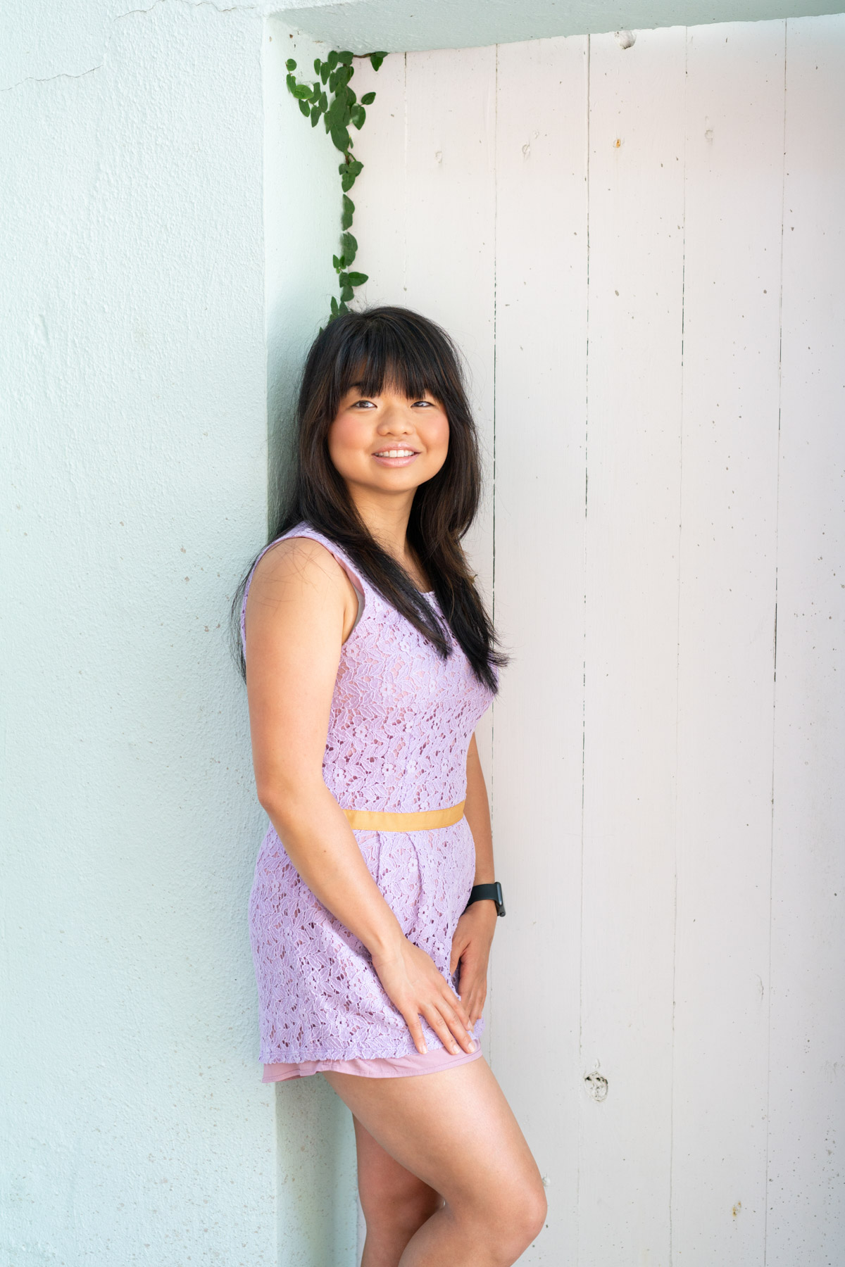
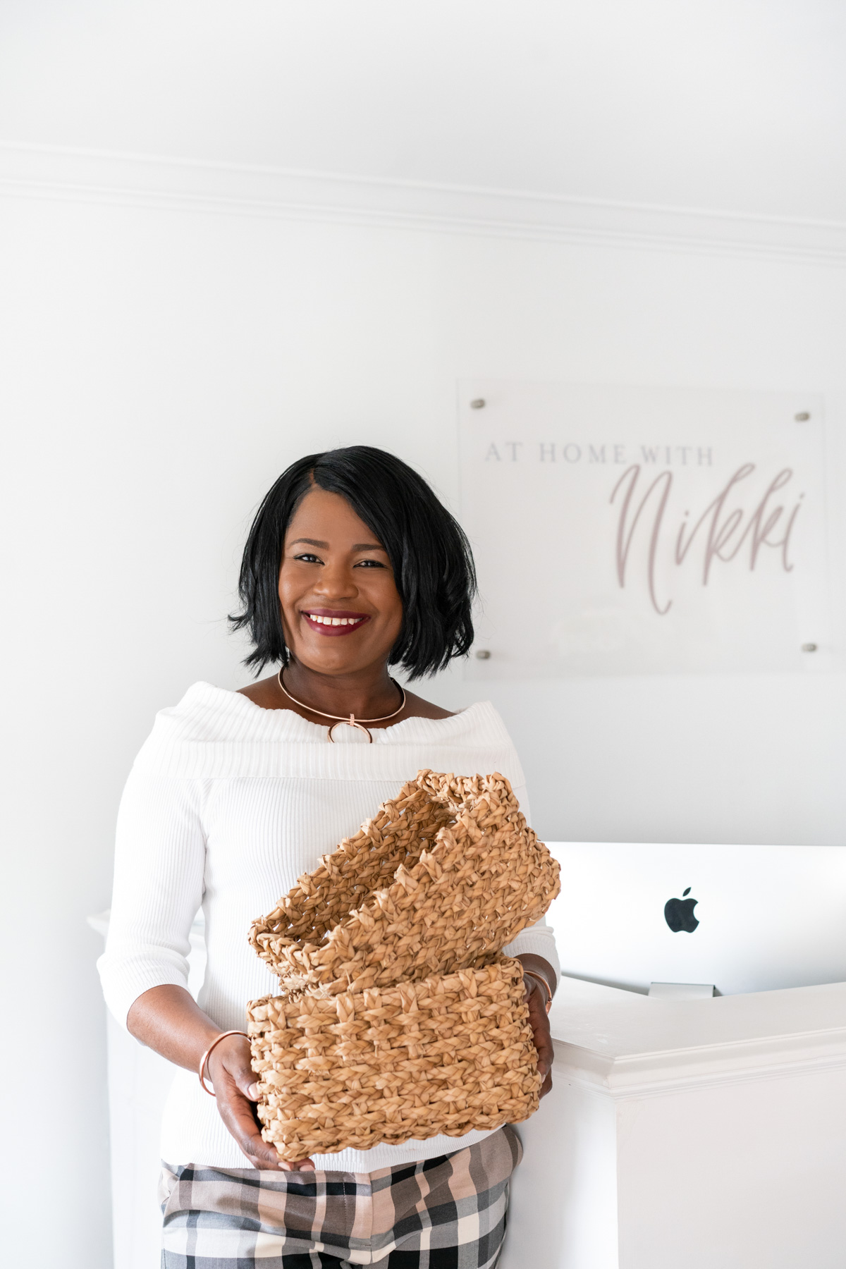
First up, you need a photo of yourself on the About page of your website. This is the photo my clients typically dread taking the most, but it’s an essential part of your website! You need a portrait of yourself because it will directly increase the chance that you connect with site visitors (AKA, your potential customers). They will connect more deeply to your company if they know the person behind the business. It’s simply not enough to expect your products and services to speak for themselves. You have to go a step further with a personal connection.
Ask your photographer for a close-up portrait of yourself looking at the camera. Your potential clients and customers will connect more strongly if they can see your eyes and smile. Wear your favorite, most comfortable outfit that feels the most like “you” for this shot. Your photographer will help you pose, but if you want a little pre-shoot practice, head to my post How to Pose for a Photoshoot.
Check out a few of these examples from my own clients. Some use props or their outfits to show off their personality. The important thing is that the portrait on your About page feels like you.
P.S. If you have a team, you should include their portraits on the About or Team page as well!
2. Process shot of you doing your creative work
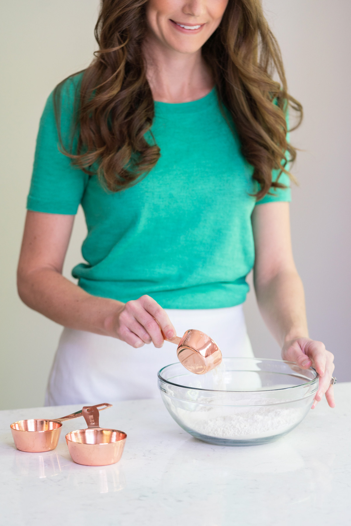
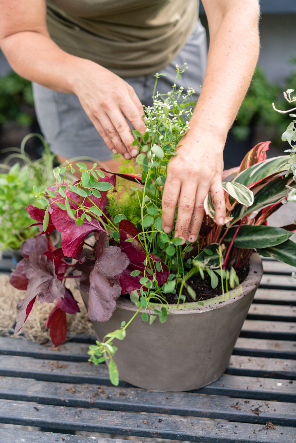
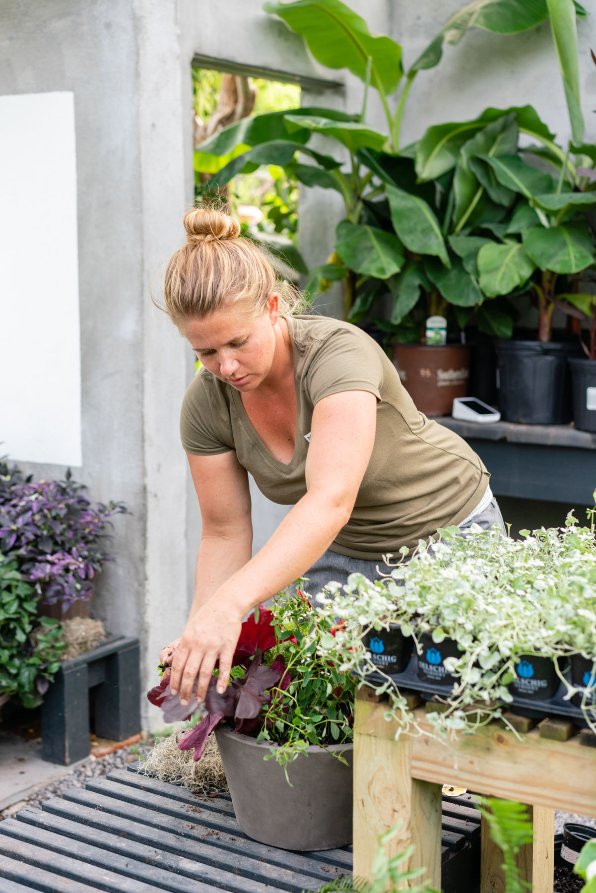
A process shot is a photo that shows you doing the thing you do best. These shots are important to include on your website so your visitors can see what it is you do, and what it takes to do it. Ask your brand photographer to take photos of every part of your creation process. Whether that’s physically creating a calligraphy invitation suite by hand or working with a coaching client, show off what the entire process looks like.
It’s helpful to write down every step so that your photographer can visualize how to photograph each step of your process. Select at least one of these photos to put front and center on your website. People love to see behind the scenes, and it helps them connect deeper with you and your mission.
Process shots are my absolute favorite to capture for my clients! Check out a few of these examples from my clients’ brand shoots.
3. Lifestyle shot
Next up, you need a brand photo that allows your future clients and customers to imagine what it looks like to work with you or own what you’re selling. Consider this: the reason why we’re attracted to high-end designer clothing and car advertising is that the ads prompt us to imagine what it would be like to own said designer bag or car. You naturally start to think about how your life might be improved by their luxury product.
While you might be selling something completely different in your business, the same principle applies. When your clients and customers can imagine their lives being bettered by your product or service, they’re more likely to purchase. And, speaking as a woman that likes to plan, I personally like to know what I’m getting into before I purchase something. Whether I’m buying a product or service, I want to know what the experience will look like to make sure it’s an investment I feel great about, and that will improve my life.
The imagination shot can take many forms. Maybe a friend or colleague can pose as a client in your brand photos. You could also include photos of your product being used by your ideal client. Take a look at some of the ways my clients have interpreted the lifestyle shot.
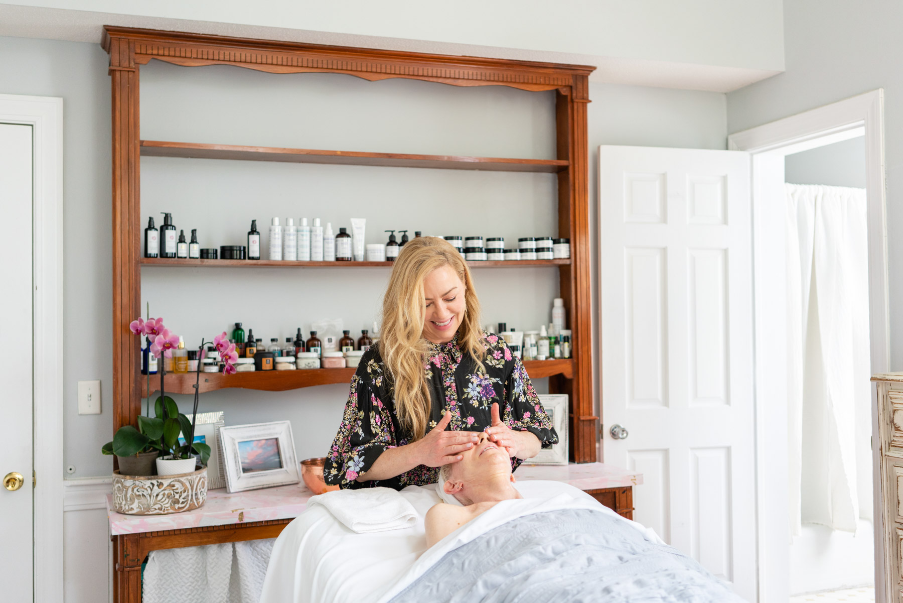
Verte Skincare
4. Detail shot with your brand colors and on-brand props
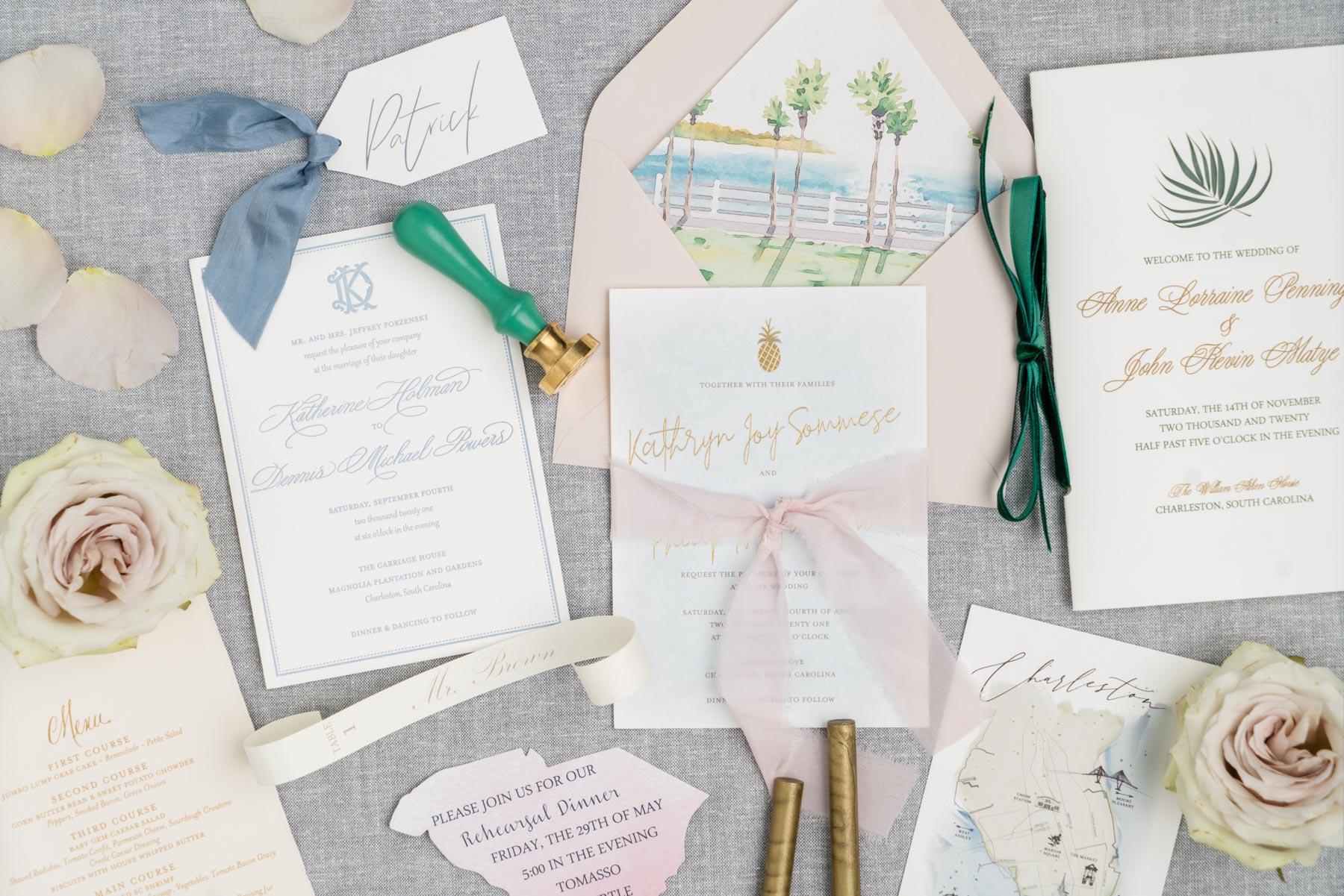
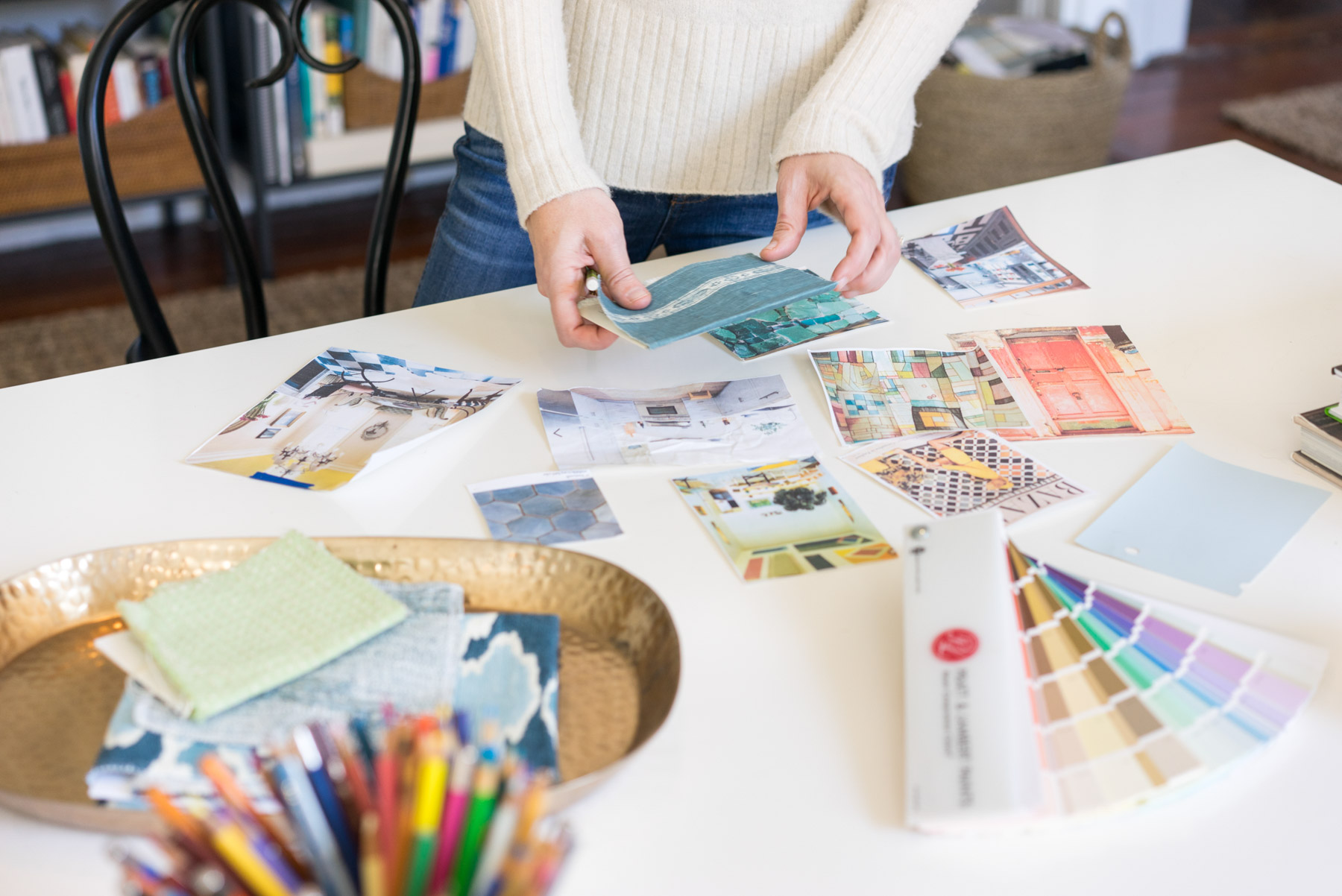
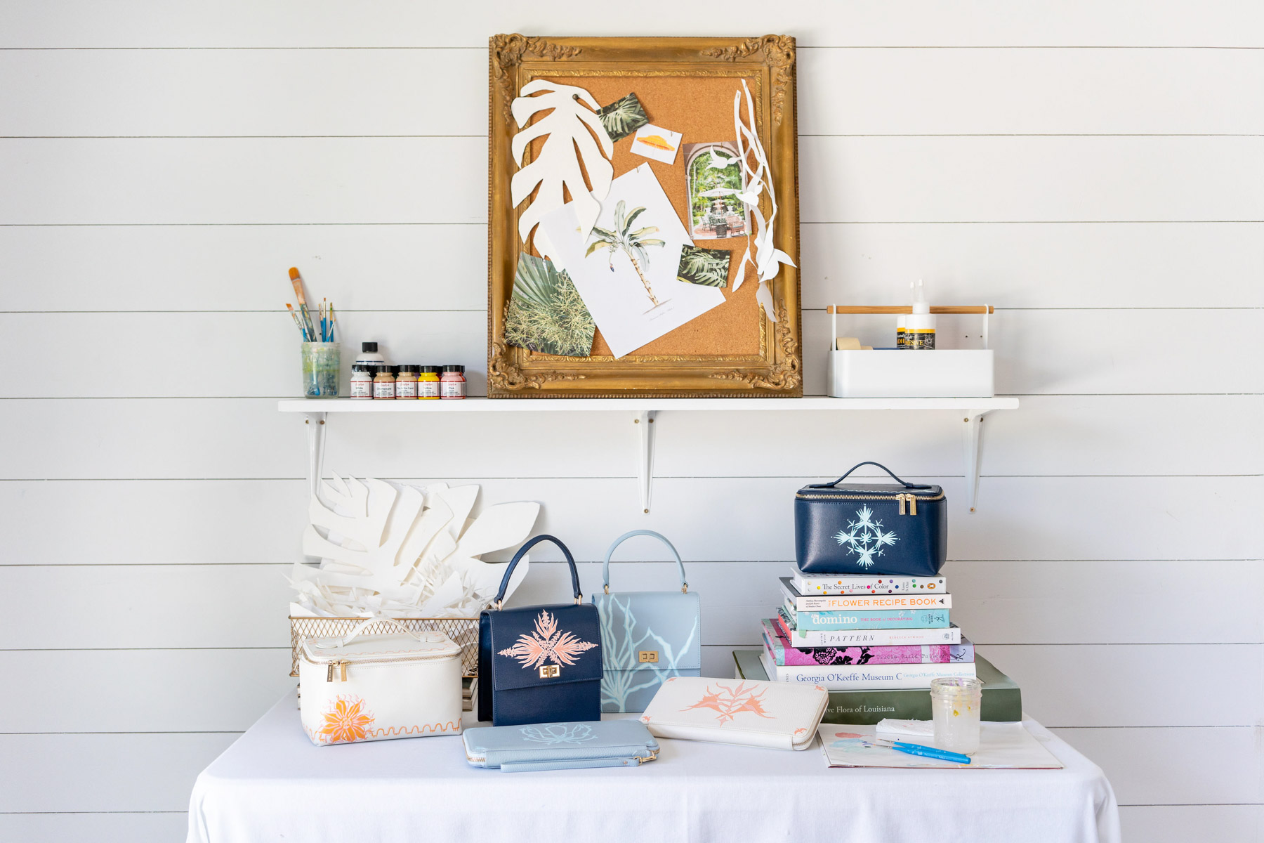
Breathe a sigh of relief when I tell you: every photo on your website does not have to feature your face (even though it’s beautiful and people love seeing it!). Ask your brand photographer to help you style a horizontal flat lay or detail shot that includes on-brand props and your brand colors. These shots are perfect for website banners, and can often be used with text overlay. Depending on the styling, you can sometimes even add a pair of hands in the shot to add an element of life. Maybe the hands are writing or placing a prop. Here are some examples from my clients to get your ideas flowing.
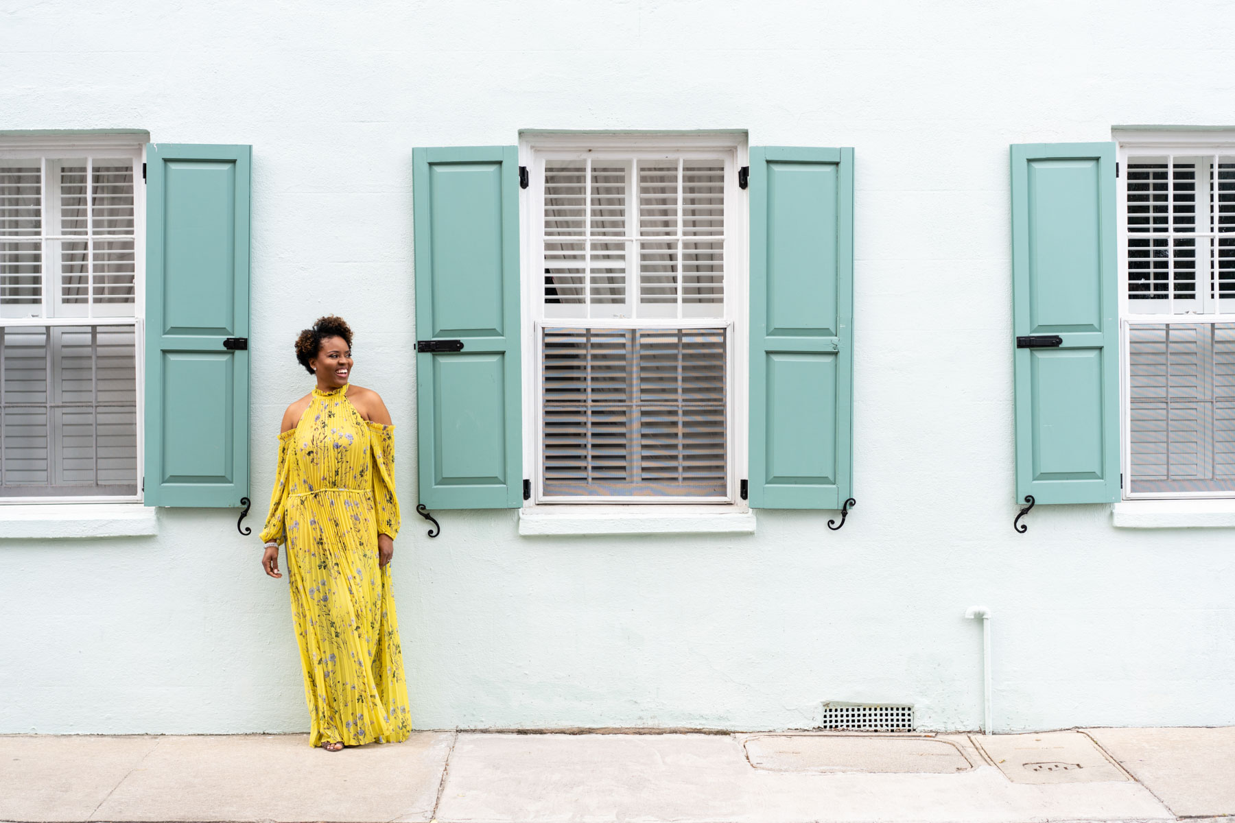
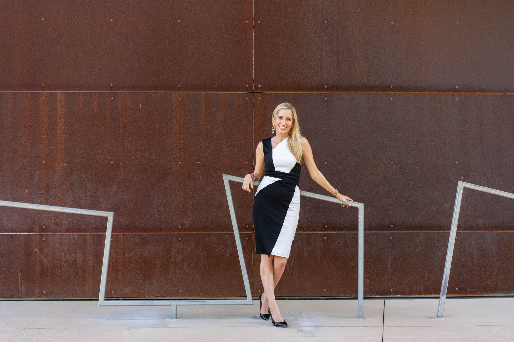
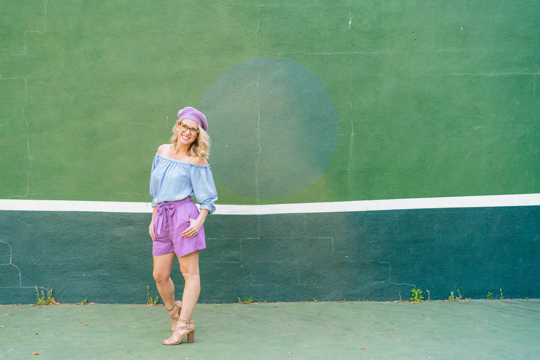
5. Wide shot with room for text overlay
This could be any type of shot you’d like. Make sure to let your brand photographer know you’d like a horizontal shot with a blank or simple area that you can overlay text with. The key is having an area that isn’t too busy in the photo so that the text won’t get lost. My favorite type of shot for this is to have my clients on one side of the frame, either walking or looking at the camera.
Great background options for this shot are either a completely solid backdrop like a seamless paper. One of my favorite options is to find a textured wall that is in the color scheme of my client’s brand colors. In Charleston, that’s easy to do with our wide array of colorful homes, but any city or town should have a wall that will work with your brand. Take a walk or drive one day to scope out a location, or ask if your photographer does this as part of your package.
I hope this post has helped you visualize and plan the brand photos you need on your website! Whether you’re starting from scratch or doing a quick refresh, these 5 photos will instantly upgrade your online presence. For more on how to use your brand photos, check out the posts below!
Sign Up to see More of my Brand Photoshoot Shot List
READ NEXT






+ SHOW comments
Add a comment